 Designing banners that perfectly complement your website’s theme is more than just a design challenge — it’s a branding strategy. A well-designed banner enhances credibility, strengthens visual storytelling, and subtly guides users toward desired actions. However, if your banner clashes with your site’s layout, tone, or color scheme, it can easily disrupt the experience, lower trust, and increase bounce rates. In this guide, we’ll walk through every process step — from understanding your site’s visual DNA to crafting banners that integrate beautifully while performing effectively.
Why Matching Your Banner to Your Website Theme Matters
Your brand identity is reflected digitally on your website. Every graphic component conveys your character and principles, from your buttons to your logo. When your banner doesn’t match the rest of your site’s design, it creates cognitive dissonance for visitors. Imagine a minimalist website with muted tones suddenly flashing a neon-green banner — it doesn’t just look odd, it feels out of place. Cohesion builds trust, while inconsistency creates friction.
A well-aligned banner reinforces your color psychology, typography, and messaging tone, strengthening brand recall. It ensures the visitor’s attention remains on the message instead of being distracted by design inconsistency. Moreover, matching design cues helps guide user flow naturally. The goal is harmony — the banner should stand out just enough to grab attention, but not so much that it feels detached from the site’s aesthetic language.
Preliminary Steps: Planning Alignment with Your Website Theme
Before jumping into design software, take a step back and assess your website’s theme. Identify your dominant and accent colors, typography hierarchy, and the mood your site evokes. Is it sleek and corporate? Warm and inviting? Playful and creative? These emotional cues shape the direction of your banner’s design.
Next, clarify your banner’s intent. Are you promoting a sale, announcing new content, or highlighting a product launch? Each goal demands a slightly different tone and layout. For example, promotional banners often rely on strong contrast and bold CTAs, whereas informational ones can use softer imagery and balanced spacing.
Lastly, think about audience context. A first-time visitor might need a banner that introduces your brand, while returning customers prefer timely offers. Aligning your purpose, audience, and brand essence ensures that every banner element is a natural continuation of your website’s narrative.
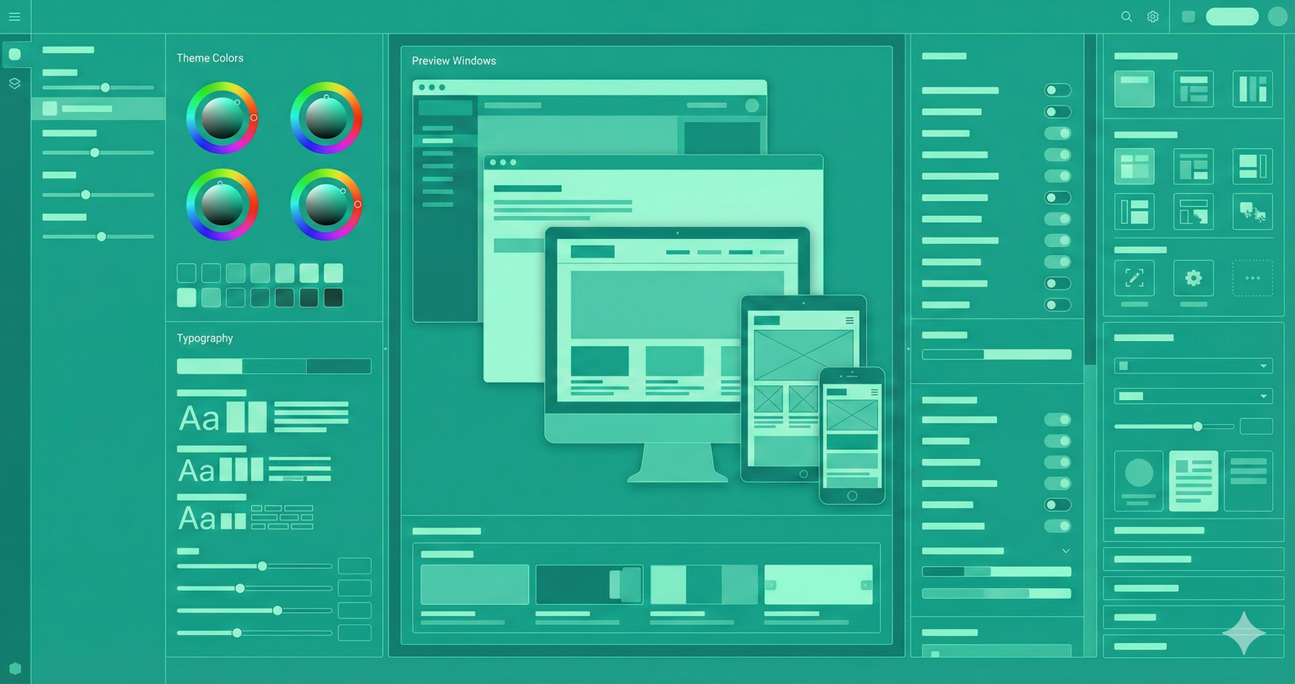
Design Guidelines: Making the Banner Reflect Your Website Theme
Designing a cohesive banner begins with consistency but thrives on intentional variation. Your banner shouldn’t be a replica of your site; instead, it should echo it. Start with your established color palette. Choose one or two dominant hues already used on your site and incorporate subtle gradients or overlays for depth. Avoid adding completely new colors unless they support your brand identity.
Typography is equally crucial. Introducing an ornate script type can feel inconsistent if your website uses a clean sans-serif font. Keep headlines bold and legible; reserve decorative fonts for emphasis. Maintain generous whitespace to ensure visual breathing room.
Imagery should complement your site’s style — whether that’s sleek product photography, textured backgrounds, or custom illustrations. Keep the focal point clear, focusing on your call-to-action (CTA). Every line, shape, and texture should guide the viewer’s eye through a smooth, intuitive visual journey that mirrors your website’s rhythm.
Step-by-Step Workflow: From Concept to Live Banner
A successful banner isn’t designed by accident — it follows a deliberate creative workflow. Begin by defining your objective: identify the specific action you want visitors to take. Next, audit your website’s style — note key visual elements like colors, shapes, and layouts. Then, sketch initial concepts or create a mood board to visualize how the banner could integrate seamlessly with your existing theme.
Once you’ve defined your direction, draft concise copy that captures your message. Use a strong headline, one short supporting line, and a clear CTA. Start laying out elements following your site’s design grid in design tools like Figma, Canva, or Photoshop.
When the visual is ready, test it on multiple devices — banners often look perfect on desktop but distorted on mobile. After refining responsiveness, preview it live on your site, check loading times, and if possible, conduct A/B testing to identify which version resonates most with your audience.
- Define objective – What is the banner for? (E.g., “Promote new summer collection”).
- Audit website theme – Document your site’s palette, fonts, layout, and imagery style.
- Sketch/mood board – Create rough sketches or boards of how the banner might look, aligned with the theme.
- Draft message – Craft headline, sub-text, CTA. Keep it short, value-focused, action-oriented.
- Design the layout – Pick background, imagery, typography, and button using your site theme elements.
- Adjust for branding – Ensure the colours, fonts, brand logo or mark are correctly integrated.
- Optimize responsiveness – Create versions for desktop and mobile (maybe adjust text size, reposition elements).
- Test performance/accessibility – Check load times, file size, readability, alt text, and mobile look.
- Preview on site: Insert the banner into your site in a staging environment and see whether it fits with the theme.
- A/B test (optional but recommended) – Try variants (different headline, different image, colour variant) and measure engagement (click-through, time on page).
- Deploy and monitor—Once you’re happy, publish. Monitor analytics, such as bounce rate, conversions, and user behaviour.
- Iterate – Based on data, refine: adjust colours, message, CTA, timing.
Common Pitfalls (and How to Avoid Them)
Even with careful design planning, many banners fall short because of critical, straightforward mistakes. The most common one is overdesign. Designers sometimes overload banners with text, icons, and colors, resulting in clutter and confusion. Simplicity and focus are key — one primary message per banner is enough.
Another frequent issue is contrast mismanagement. Text that blends into a background image or low-contrast CTA buttons can make your banner ineffective. Always test readability, especially on smaller screens. Likewise, avoid using stock photos that don’t match your brand’s tone; inconsistent imagery can cheapen the overall aesthetic.
Many overlook responsiveness, creating banners that appear stunning on desktop but broken on mobile. Neglecting alignment with the website’s typography, padding, and grid spacing is another silent killer of cohesion. The solution is balance — clean composition, consistent branding, and thoughtful spacing. A harmonious banner doesn’t scream for attention; it commands it quietly through precision and unity.
Real-World Examples & How They Align with Website Themes
Visual alignment is best understood through examples. Consider a luxury fashion website: its banners typically use muted colors, serif fonts, and soft imagery that reflect elegance and sophistication. The banner might highlight “New Autumn Collection” with minimalist typography over a blurred photo background, perfectly in tune with the brand’s refined tone.
In contrast to a tech startup’s site, bold geometric shapes, gradient overlays, and dynamic animations often dominate. A matching banner might feature vector illustrations and clean sans-serif fonts that express innovation and energy.
E-commerce platforms like Shopify stores often utilize white or light grey backdrops. Their banners feature large product photos, vibrant accent colors, and direct CTAs such as “Shop the Look.” The cohesion comes from maintaining consistent color saturation, typography, and button styles. Ultimately, banners should never feel added on — they should feel like the website speaks directly to the visitor.
Measuring Success & Iteration
Design doesn’t end when your banner goes live — it begins a new phase: optimization. Start by tracking measurable metrics such as click-through (CTR), conversion, and bounce rates. Using tools like Hotjar or Google Analytics, you can see how users engage with your banner.
Use A/B testing to compare versions — change one variable at a time, like the CTA color or headline wording. The data you gather reveals which design elements drive engagement. If users click but don’t convert, your issue may lie beyond the banner — possibly on the landing page.
Gather qualitative feedback too. Ask loyal customers or team members if the banner feels “on-brand.” Review design consistency periodically— old banners may feel outdated as your site evolves. The goal is continuous refinement. Remember, design isn’t static; it’s a conversation between your brand and your audience that grows with every click and impression.
Understanding Color Psychology in Banner Design
Colors silently shape perception. They evoke emotions, influence decision-making, and reinforce your brand’s character. Understanding color psychology helps you create harmony between design and message when designing banners. For instance, blue communicates trust and stability — ideal for financial or corporate websites — while red triggers excitement and urgency, perfect for sales or limited-time offers.
However, your banner’s colors must align with your website’s established palette. A sudden bright-red banner could feel abrasive if your site’s tones are neutral and calm. Instead, use accent hues already present in your design system. Additionally, consider contrast and accessibility: ensure text remains readable for all users. A high-contrast color scheme improves comprehension and visual appeal.
Ultimately, the goal isn’t just to match colors and emotions. The perfect banner doesn’t compete for attention — it complements the website’s emotional landscape while precisely guiding the viewer’s response.
The Role of Typography in Cohesive Banner Design
Typography is more than decoration; it’s a voice. The fonts you choose for your banner either harmonize with your website or disrupt its rhythm. If your website uses a sleek sans-serif font, maintaining that style in your banner ensures consistency. Using a completely different typeface — a cursive or decorative font — risks confusing visitors and diluting your brand identity.
Font hierarchy also matters. Headlines should command attention without overwhelming the rest of the layout. Subheadings and CTAs need clarity and readability. Avoid using more than two font families; too many typefaces create visual noise.
Pay attention to letter spacing, line height, and alignment — subtle adjustments can dramatically improve balance. Typography should flow naturally with your website’s formal, minimalist, or playful tone. Remember, every letter contributes to how users perceive your brand; consistent typography transforms design into a coherent conversation between text and visual storytelling.
Crafting the Perfect Call-to-Action (CTA) for Visual Harmony
A call-to-action is the heartbeat of any banner. It’s where design, psychology, and strategy converge. But here’s the catch — even a perfectly worded CTA can fail if it visually clashes with your website’s aesthetic. The CTA button must be distinct yet consistent with your theme. For example, if your site uses rounded buttons in soft tones, replicate that form in your banner instead of using a harsh, blocky alternative.
The wording also plays a role in cohesion. “Get Started,” “Learn More,” or “Shop Now” should match your brand’s tone — whether friendly, professional, or luxurious. Surround the CTA with enough whitespace to draw focus, and use color contrast carefully: high enough to stand out, subtle enough to belong.
A cohesive CTA doesn’t scream for attention; it gently guides the viewer’s eye toward conversion — a whisper that persuades more effectively than a shout.
Adapting Your Banner Design for Different Platforms
Consistency across devices and platforms ensures that your banner’s impact remains strong wherever it appears. What looks flawless on a desktop might appear cramped on mobile or lose legibility on a tablet. Therefore, designing banners responsively is non-negotiable.
Start by understanding placement and aspect ratio. A website header banner might be 1920×600 pixels, while a social media ad banner could require 1080×1080. Each context demands a tailored version, not a resized copy. Adjust font sizes, crop images strategically, and ensure CTAs remain prominent without breaking composition.
Additionally, monitor how colors render across screens — a vibrant orange on one monitor may look duller on another. Use sRGB color profiles for consistency. Test your banners on real devices rather than simulations. When every platform delivers a unified experience, your brand feels intentional, reliable, and polished — an essential quality in today’s visually fragmented digital landscape.
Using Visual Hierarchy and Composition for Balance
Great design tells the eye where to look first, second, and third — that’s the power of visual hierarchy. Without it, even beautiful banners can feel chaotic. To achieve this balance, establish a clear focal point — usually your headline or product image — and then guide the viewer toward your CTA using alignment and contrast.
Use size and spacing strategically. Larger elements draw attention, while minor details provide depth. Contrast — whether through color, brightness, or shape — helps separate sections without making them clash. Balance every bold visual with subtle whitespace; it gives breathing room and sophistication.
Compositional strategies like the Golden Ratio or the Rule of Thirds can produce a naturally beautiful structure. When your banner mirrors your website’s existing hierarchy, the transition between elements feels seamless. The result? A design that doesn’t just look balanced — it feels orchestrated, like a visual symphony playing in harmony with your site.
Future Trends in Banner Design and Website Integration
Digital design evolves fast — and banners are evolving with it. The next wave of cohesive banners focuses on micro-interactions, motion graphics, and personalization. Subtle animations — like gentle hover effects or fading transitions — can attract attention without overwhelming the page. However, they should align with your website’s animation style for visual unity.
Personalized banners, powered by AI and analytics, are becoming the norm. They adapt to user behavior, displaying messages that align with previous interactions. Imagine a visitor seeing a banner highlighting products related to their last visit — visually styled to blend with your theme but dynamically tailored for relevance.
Finally, sustainability in design — both visual and performance-based — is rising. Lightweight banners with compressed assets and eco-conscious palettes reflect modern brand values. The future of banner design isn’t about louder visuals; it’s about wiser, subtler, and more emotionally intelligent harmony with your website’s evolving aesthetic.
FAQs
What size should a website banner be?
Banner sizes vary depending on placement, but standard dimensions include 1920×600 pixels for hero banners and 728×90 pixels for headers. Always design responsively to fit both desktop and mobile screens.
How can I make my banner match my brand identity?
Use your website’s color palette, typography, and tone consistently. Align imagery and layout styles so your banner feels part of your overall brand rather than a separate element.
Which colors work best for banners?
The best colors depend on your brand and audience. Use your primary and accent colors strategically, and ensure strong contrast for readability while maintaining visual harmony.
What makes a banner effective?
Clarity, balance, and a strong call-to-action (CTA) are essential. Keep text minimal, ensure high-quality visuals, and make the CTA button stand out naturally within your website’s design language.
Conclusion
Creating banners that match your website theme is an act of visual storytelling. Every shape, color, and font speaks your brand’s language, whispering subtle cues of reliability and intent. A cohesive banner reassures visitors that they’re in the right place — that what they see aligns with what they expect from your brand.
To achieve this, start by understanding your site’s aesthetic DNA. Keep designs consistent, CTAs clear, and messages concise. Prioritize readability, responsiveness, and alignment with your brand’s emotional tone. Avoid overdesigning; embrace Simplicity with purpose.
Finally, measure results and iterate — even the best banners can be refined over time. Whether you run an online shop, blog, or SaaS platform, a well-aligned banner elevates the entire browsing experience. When your banners and website move in visual harmony, your brand doesn’t just look cohesive — it feels trustworthy, intentional, and unmistakably you.