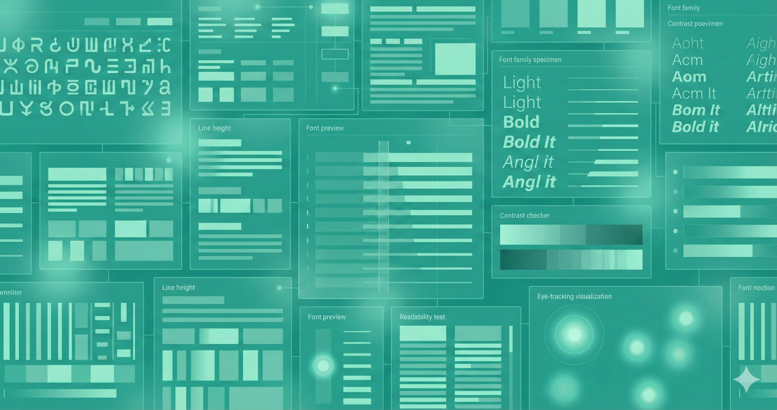
When building digital ad campaigns—whether for Facebook, Google Display, Instagram, or YouTube—the typography you choose silently defines your ad’s identity. Fonts don’t just present words; they communicate tone, trust, and intent. A sleek sans-serif font can convey modernity and efficiency, while a handcrafted script font radiates creativity and warmth. In an era of fleeting attention, the font becomes the visual handshake between brand and audience. If the typography fails to capture attention in the first second, the message—no matter how brilliant—may never be read.
This comprehensive guide explores why typography is essential in digital ads, the criteria for selecting the right fonts, and a curated list of the most effective typefaces used by marketers and designers in 2025. Whether you’re crafting a luxury lifestyle banner, a minimalist product ad, or an energetic promo campaign, the right font can amplify engagement, trust, and conversion.
Why Font Choice Matters in Digital Advertising
Typography is a science wrapped in art. It dictates how an audience perceives your message before processing the words. In digital advertising, where milliseconds define success, font choice shapes the first impression and directs emotional resonance. Studies in visual psychology reveal that people make subconscious judgments about credibility within 50 milliseconds—and font design contributes significantly to that impression.
Readable fonts create cognitive ease, allowing users to absorb the message faster, while cluttered or decorative fonts introduce friction. Consider this: in an ad carousel, clean typography ensures your offer stands out amid noise. Fonts reinforce brand identity—imagine Coca-Cola without its distinctive script or Apple using Comic Sans. A mismatch in typography and brand persona causes subconscious dissonance. Moreover, different devices render text differently; a legible font on a 4K desktop might blur on a smartphone screen. Thus, balancing beauty with legibility ensures your ad performs consistently across environments.
Key Criteria for Choosing Fonts for Digital Ad Creatives
Selecting the right font isn’t about personal taste—it’s about aligning visual psychology, technical compatibility, and brand expression. When choosing fonts, start by evaluating readability and legibility. At small pixel sizes, some fonts lose clarity, especially those with thin strokes or excessive ornamentation. Always test on mobile, tablet, and desktop views to confirm crispness and balance.
Next comes brand fit. Every brand has a personality—some are bold and energetic, others minimal and refined. Fonts like Montserrat or Open Sans evoke modern professionalism, while Baskerville or Playfair Display convey sophistication and heritage. Consistency across campaigns strengthens recall and trust.
Then, evaluate platform adaptability. Social media ads, display banners, and video thumbnails all impose size and ratio restrictions. The font must scale seamlessly. Technical efficiency is equally crucial: lightweight web fonts ensure quick load times, preventing ad lag. Finally, limit your palette to two to three fonts at most to maintain visual hierarchy and coherence throughout the ad set.
Top Font Options for Digital Ads
Several fonts that blend performance, versatility, and style stand out as timeless choices for digital advertising. The following selections cover a range of personalities—modern, traditional, and expressive—ensuring you can match your typography to your brand’s identity and audience.
Each font listed below has been tested and proven across thousands of campaigns. They maintain readability at various screen sizes, support multiple weights, and deliver consistent rendering across browsers. Additionally, all are web-safe or available via open-source platforms such as Google Fonts, ensuring compatibility without licensing hurdles.
Remember, the “best” font isn’t always the trendiest—it’s the one that aligns with your campaign goal. If your ad emphasizes speed and clarity, choose a geometric sans-serif. For elegance and authority, a serif might better reflect your message. Let’s explore the top-performing fonts shaping digital creatives today.
Montserrat
Montserrat’s geometric structure and modern symmetry make it one of the most adaptable fonts for online creatives. Initially inspired by the traditional signage of Buenos Aires, it combines a touch of vintage elegance with a contemporary digital edge. Its bold uppercase letters are ideal for headlines, while its lighter weights maintain readability for captions or secondary text.
Designers favor Montserrat for campaigns that need to look clean, bold, and professional. Tech startups, lifestyle brands, and digital agencies often choose it because it reflects clarity without appearing sterile. The font’s versatility allows it to pair seamlessly with more neutral companions like Roboto or Lato. Moreover, its large x-height ensures perfect legibility even on small mobile screens or high-contrast backgrounds. Whether you’re designing carousel ads or YouTube thumbnails, Montserrat delivers balance—professional enough for corporate messaging yet warm enough for creative storytelling.
Trade Gothic
Trade Gothic carries an air of sophistication and authority, which explains why it has been a staple in advertising for decades. Designed in the 1940s, it merges modern industrialism with humanist undertones, giving it structure and soul. Its condensed letterforms make it perfect for headlines or call-to-action buttons where space is limited but impact is required.
Finance, consulting, and technology brands gravitate toward Trade Gothic because it communicates stability and credibility. Its no-nonsense character makes it ideal for straightforward messages—think “Download Now” or “Limited-Time Offer.” Despite its clean edges, it retains subtle warmth, preventing it from feeling overly corporate. Trade Gothic also supports extensive weights and italics, allowing designers to create clear typographic hierarchies. It brings a polished, cohesive look that resonates across professional campaigns and high-trust industries when used alongside a lighter sans-serif or neutral body font.
Helvetica (and Similar Sans-Serifs)
Helvetica remains the undisputed classic of digital typography—a font that embodies neutrality, balance, and precision. Born in the mid-20th century, Helvetica was engineered for legibility and universality, and it continues to dominate digital advertising because it simply works. Its clean lines and proportional spacing make it effortlessly readable in almost any context, from Instagram carousels to banner ads.
Brands that value clarity and timelessness—such as Apple, BMW, and Panasonic—have relied on Helvetica for decades. It doesn’t shout; it whispers confidence. Helvetica’s wide range of weights for digital creatives means you can establish hierarchy without changing fonts: bold for headlines, regular for copy, and light for subtext. Designers seeking alternatives can also explore Arial or Neue Haas Grotesk for similar geometry but subtle tone variations. The simplicity of Helvetica ensures that your message—not the font—remains the focal point, reinforcing trust and minimalism.
Baskerville and Serif Options for Headlines
Baskerville is the quintessential serif typeface that merges classical beauty with intellectual gravitas. Developed in the 18th century, its refined strokes and balanced contrast create an aura of elegance that few fonts can replicate. In digital advertising, Baskerville and its modern serif counterparts—like Playfair Display or Libre Baskerville—add a touch of refinement ideal for luxury, fashion, or editorial brands.
Because serif fonts carry historical connotations of tradition and trust, they’re perfect for campaigns targeting mature or affluent audiences. They create a sense of permanence and authority—qualities invaluable to industries like jewelry, finance, or fine art. However, readability at small sizes can be challenging; hence, limit serif use to headlines or short taglines. Pairing Baskerville with a clean sans-serif body font like Open Sans or Raleway balances heritage with modernity, crafting a sophisticated ad aesthetic that appeals to emotion and intellect.
Display, Script, and Decorative Fonts (Used with Caution)
Display or script fonts can instantly infuse personality into your creative—but they require restraint. These fonts are designed to draw attention, not to sustain readability. In digital ads, where every second counts, use them sparingly for emphasis, not narration. Think short bursts: “SALE,” “LIMITED TIME,” or “NEW COLLECTION.”
A well-chosen decorative font can differentiate your brand and evoke emotion. Hand-lettered scripts, for example, suit artisanal or boutique brands, while bold geometric displays can energize fashion or entertainment ads. However, overusing them leads to clutter and confusion. Always test these fonts across devices; thin swashes or ornate curves may vanish on smaller screens. When paired strategically with simple sans serifs, display fonts act like visual spices—adding flair without overwhelming the dish. The golden rule is to contrast style with clarity, ensuring the message always takes priority over aesthetics.
How to Pair and Use Fonts Effectively in Ads
Mastering typography is about orchestrating contrast, rhythm, and hierarchy. Font pairing isn’t random—it’s deliberate design harmony. A potent combination typically features a statement font and a supporting font. The headline font should grab attention through boldness or character, while the secondary typeface maintains legibility and balance. For example, pairing Montserrat Bold with Open Sans Regular delivers clarity and professionalism.
Hierarchy ensures that your viewer’s eyes travel logically from headline to subheading to CTA. Use color, weight, and size to naturally direct the eye. Consistency is key; applying the same font families across multiple ad variations reinforces brand recall.
Equally important is restraint. Using more than two or three fonts introduces cognitive noise. Maintain alignment, breathing space, and contrast—white space amplifies text presence. Finally, test everything. What appears perfect on a large monitor may look cramped on a mobile device. Great typography isn’t static—it’s responsive, intentional, and data-driven.
Mistakes to Avoid in Font Selection for Digital Advertising
Even experienced designers stumble over typography pitfalls. The most common error is prioritizing aesthetics over function. A font might look beautiful in mockups but fail miserably in live environments. Always test readability under real-world conditions, such as different screen resolutions, light modes, and aspect ratios.
Another misstep is using too many fonts. Variety can quickly become chaos, diluting brand coherence. Consistency builds trust; inconsistency erodes it. Similarly, many creatives fall into the trap of using overly decorative or trendy fonts that age poorly or clash with brand identity.
Another oversight is ignoring accessibility. Low contrast between text and background can alienate visually impaired users, reducing engagement and compliance. And don’t forget load speed—large custom fonts can delay ad rendering, increasing bounce rates. The rule of thumb is that if the typography distracts from the message, it fails. Simplicity, alignment, and legibility always win in the long run.
Trending Considerations for 2025 and Beyond
As digital ecosystems evolve, so too does typography. The emerging trend of variable fonts allows designers to dynamically adjust weight, width, and slant in real time—creating responsive text that adapts to any screen. This flexibility improves aesthetic control and performance, reducing file size by consolidating multiple font styles.
Another growing priority is mobile-first typography. With over 70% of ad impressions happening on mobile devices, fonts must be optimized for small screens. Designers now test typographic legibility using live previews, ensuring crisp edges even at micro-sizes.
Globalization is reshaping font selection as well. Brands now require fonts supporting extended character sets, from Cyrillic to Arabic to Devanagari. Accessibility continues to influence decisions, too—open-source fonts designed for visibility across demographics are gaining traction. Finally, brands increasingly treat typography as an asset of voice—consistent across video, display, and social media—to unify identity in the age of omnichannel marketing.
Sample Font List: Best Fonts for Digital Ad Creatives
| Font | Style | Best Use in Ads | Brand Fit |
| Montserrat | Geometric Sans | Headlines, body text | Modern brands, tech, lifestyle |
| Trade Gothic | Sans | Bold headlines | Professional, mature, corporate |
| Helvetica | Neo-Grotesque | General body text | Minimalist, timeless, universal |
| Baskerville | Serif | Luxury headlines | High-end, editorial, heritage |
| Display/Script | Decorative | Short emphasis words | Fashion, boutique, creative campaigns |
Each font offers a distinct character, but all share common traits—clarity, scalability, and personality. The ideal font combination balances emotion with utility. This table is a quick reference when conceptualizing new ad designs and refining them through testing.
Implementation Checklist for Your Next Ad Campaign
- Define Brand Voice – Identify your brand’s emotional tone. Are you sleek, playful, elegant, or bold? Let this guide your typography.
- Select Primary and Secondary Fonts—Use one for headlines and another for supporting copy. They should complement, not compete.
- Test Legibility – Check readability across mobile, tablet, and desktop devices. Adjust weights and spacing if necessary.
- Ensure Contrast – Dark text on light backgrounds (or vice versa) improves accessibility.
- Optimize Performance – Use web-safe formats like WOFF2 to reduce load time.
- Apply Hierarchy – Headlines should dominate; body text should inform.
- Limit Font Count – Stick to two or three fonts maximum to maintain unity.
- Maintain Consistency – Keep typography uniform across ad sets and landing pages.
- A/B Test Variations – Evaluate different font weights or pairings for conversion.
- Measure Impact – Monitor performance analytics; tweak typography based on user behavior.
FAQs
What makes a font good for digital ads?
A good font is readable on all devices, aligns with brand personality, and loads quickly. Clarity and contrast are essential for grabbing attention fast.
Should I use multiple fonts in one ad?
Limit to two fonts—one for headlines and one for body text. Too many create visual clutter and weaken brand identity.
Are serif fonts suitable for digital ads?
Yes, but mainly for headlines or luxury campaigns. Use clean sans-serifs for body text to maintain readability.
What font size works best for mobile ads?
Headlines should be large enough to read instantly—at least 20–24px. Body text should stay above 16px for clarity.
How can I test which font performs best?
Run A/B tests comparing click-through and engagement rates. The best-performing font balances style with readability.
Conclusion
Typography is the silent storyteller of digital advertising. While visuals and copy spark attention, fonts sustain engagement and communicate trust. Every stroke, curve, and spacing decision carries subconscious weight, influencing perception and action. Choosing the right font isn’t mere decoration—it’s strategic branding.
Montserrat offers clarity for modern creatives, Trade Gothic provides professionalism, Helvetica ensures neutrality, and Baskerville adds elegance. Used with intention, typography strengthens recognition and amplifies persuasion. Remember, the best digital ads marry creativity with precision. Fonts should never fight for attention—they should frame the message so perfectly that the audience forgets to question why it feels right.
In an age driven by pixels and perception, font selection remains both art and advantage. Choose wisely, test continuously, and let your typography become the visual voice that converts curiosity into clicks.