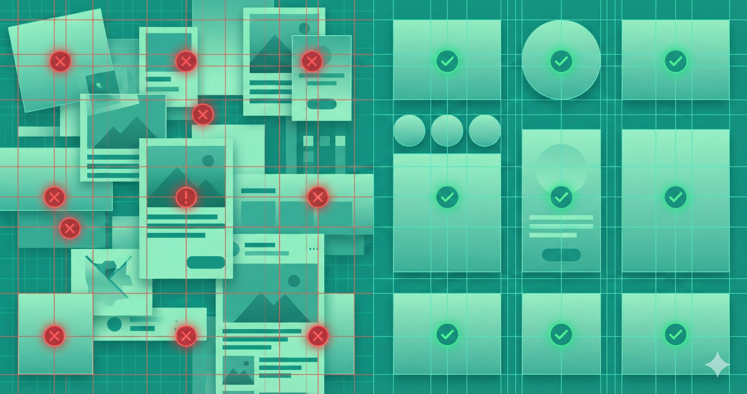
Banner ads might be small, but their impact on your campaign can be enormous—or disastrous. A poorly designed ad can drain your budget and tarnish your brand before a user registers your name. Many marketers underestimate the subtleties in banner design: visual hierarchy, message clarity, and emotional appeal all play key roles in grabbing fleeting attention spans. Unlike long-form content, a banner has just seconds—often less than one—to persuade. When done right, it’s a conversion magnet; when done wrong, it becomes invisible. You must understand what to include and avoid when crafting banners that convert. In this guide, we’ll dissect the most common design mistakes that sabotage banner performance and show you how to fix them, turning flat, forgettable graphics into persuasive digital ambassadors that attract clicks and build brand credibility.
Why Banner Ad Design Mistakes Matter
Banner ads are often the first visual handshake between your brand and a potential customer. Your audience walks away if that handshake feels weak, confusing, or off-putting. Bad design doesn’t just reduce click-through rates—it actively damages brand perception. A low-quality ad subconsciously tells users that your product might also lack quality. Research on “banner blindness” reveals that people instinctively ignore anything that looks like a generic ad. Your design must fight for attention amid a sea of visual clutter.
Furthermore, every poorly designed banner wastes ad spend—impressions cost money whether people click or not. On top of that, a poorly optimized banner can also harm user experience, slow load times, or look distorted on mobile. So yes, design matters—deeply. A professional, strategically designed banner communicates trust, precision, and relevance. Every pixel strengthens or weakens your message, so getting the design right is non-negotiable.
Lack of a Clear Objective
The most common mistake marketers make is starting without a defined goal. They create a banner just because “we need ads,” not because they know what they want those ads to achieve. Without an objective, the result is visual noise—a banner that tries to inform, sell, and entertain all at once, and fails at all three. Every ad should have one precise purpose: generating clicks, building brand awareness, driving downloads, or increasing sales. When your goal is fuzzy, your design will reflect that confusion. Before touching design software, clarify your primary KPI—conversions, traffic, or engagement—and shape the layout, color scheme, and copy around it. For instance, a “Sign Up Free” ad should spotlight the benefit of joining, while a “Buy Now” ad should highlight urgency. A focused objective keeps your banner disciplined, direct, and capable of driving measurable results.
How to fix it:
- Determine your primary KPI: click-through, lead generation, brand awareness?
- Align the design, message, and CTA to that goal.
- Create a simple brief: target audience, offer, key message, desired reaction—then design accordingly.
Poor Design Quality
Your banner ad is your storefront window online. Would you leave fingerprints, smudges, or peeling paint on your store’s display? Poor design quality—blurry images, unaligned text, awkward spacing, or inconsistent colors—instantly signals unprofessionalism. Users don’t consciously analyze these flaws, but their brains notice them. A fuzzy logo or off-balance layout subconsciously erodes trust. Using too many fonts, clashing colors, or uncoordinated visuals creates cognitive chaos and pushes viewers away. To fix this, start with high-resolution images and maintain consistent branding elements like logo placement, colors, and typography. Stick to one or two fonts and align everything cleanly using grids or guides. Test your ad at actual display sizes—what looks perfect on your large monitor may be unreadable at 300×250 pixels. Quality design isn’t just aesthetics—it’s psychology. When your banner looks crisp and cohesive, users instinctively assume your product is too.
Fixes:
- Use high-resolution images. Avoid pixelation.
- Limit your font palette to one headline font + one body font at most.
- Ensure visual hierarchy: headline > sub-text > CTA.
- Run it through quality checks: Does it look sharp in actual size? Is the text legible?
Too Much Text / Information Overload
Banner space is limited real estate, not a billboard for your company biography. Yet many brands cram every selling point, slogan, and feature into one rectangle. The result? Visual overload. Internet users scan, not read, and excessive text forces them to work—something they won’t do. Your message must be instantly digestible. A concise headline, a brief supporting phrase, and a strong call to action are all you need. If your ad needs more words to explain the offer, your message isn’t unclear. Instead, focus on clarity and hierarchy: one main benefit, supported by a crisp image and short text. Let curiosity do the rest—drive users to your landing page for details. White space isn’t wasted; it’s breathing room for your message. Simplifying your copy strengthens it, ensuring your main idea cuts through instantly and powerfully.
How to fix it:
- Keep headlines punchy and meaningful.
- Use minimal body copy—just enough to support the headline.
- Prioritize your message: what is the ONE thing you want the viewer to know or do?
- If you need more explanation, defer to the landing page—not the banner.
Weak or Missing Call to Action (CTA)
The CTA is the heart of every banner ad—it’s where interest becomes action. Yet countless designs fail because their CTAs are vague, hidden, or uninspiring. Words like “Click Here” don’t tell users what they gain. Instead, your CTA should spark excitement and clearly state the reward. Use action-oriented, benefit-driven language such as “Get Your Free Trial,” “Download the Guide,” or “Claim 20% Off Today.” Visual design matters, too: your CTA should stand out using contrast, shape, or placement. Buttons should be large enough to click easily and located where the eye naturally lands—usually the bottom right or center of the ad. Consistency is key: ensure that the message and tone of your CTA match the landing page destination. A strong CTA turns passive scrollers into active participants and converts fleeting curiosity into measurable engagement.
Fixes:
- Use actionable, benefit-oriented wording: what will the user gain by clicking?
- Make the CTA visually distinct (button, contrasting color).
- Place it where a user’s eye naturally lands.
- Ensure the copy matches the landing page—no bait-and-switch.
Poor Color, Contrast, and Typography Choices
Colors and typography speak louder than most marketers realize. Colors evoke emotions—blue signals trust, red evokes urgency, green implies growth. However, misuse of these colors can confuse users or make text unreadable. Too many bright hues can make your ad look chaotic; too little contrast can make it invisible. Similarly, typography should be straightforward and brand-appropriate. Fancy script fonts may look elegant on a wedding invitation, but become illegible at 12-point size in a banner. Always check readability at actual dimensions. Use sans-serif fonts for clarity and limit yourself to two typefaces. For colors, maintain brand consistency but prioritize contrast between text and background. Test both light and dark modes, ensuring that key text pops out immediately. A visually harmonious banner feels professional, subconsciously communicating that the brand behind it values precision, quality, and attention to detail.
Fixes:
- Stick to a 2-3 color palette maximum. Use your brand colors first.
- For optimal readability, ensure the text and background are in high contrast.
- Choose fonts suited for readable sizes on screen. Avoid overly styled scripts when time is short and the banner size is small.
- Test readability at actual banner size (especially on mobile).
Ignoring Mobile / Multi-Device Experience
Most digital interactions occur on mobile devices today, yet many banners are still designed exclusively for desktop viewing. A banner that looks elegant on a large screen may shrink into an unreadable mess on a smartphone. Fonts blur, CTAs disappear, and spacing collapses. Ignoring mobile optimization can cut your engagement in half. To avoid this, design with responsive principles—text that scales, layouts that adjust, and file sizes that load quickly even on slower networks. Test banners on multiple screen sizes and orientations before publishing. Ensure buttons are large enough for thumbs and that key text isn’t cropped. Consider vertical formats (300×600 or 320×50) specifically for mobile placements—the goal is a consistent, appealing experience across all devices. When users can view and interact effortlessly—whether on a laptop or a phone—they’re far more likely to click, engage, and convert.
Fixes:
- Design banners fluidly or create separate versions for mobile & desktop.
- Ensure file sizes are optimized so loading is fast.
- Text should remain legible on small screens—test physically if possible.
- CTA still needs to be tappable and visible on mobile.
Poor Placement & Targeting
Even the most beautifully designed banner will fail if shown to the wrong audience or displayed in an irrelevant context. Poor targeting wastes impressions, while bad placement ensures your ad goes unseen. It is like placing a luxury watch ad on a children’s website—it simply doesn’t fit. Smart targeting ensures your ad reaches users who actually care about your offer. Use demographic filters, interests, and behavioral data to narrow focus. Placement also matters visually: above-the-fold ads perform far better than those buried at the bottom of a page. Experiment with formats—leaderboards, skyscrapers, and rectangles—to see which suits your campaign goals. Contextual relevance amplifies performance; your fitness banner performs better on a health site than on a tech blog. Strategic targeting transforms banner design from random noise into precise communication, ensuring every impression counts.
Fixes:
- Define your audience: demographic, interests, behaviors. Use this to target placements.
- Choose platforms/sites relevant to that audience.
- Consider ad size, position, and visibility (above the fold vs buried).
- Rotate creatives to avoid fatigue and banner blindness.
Neglecting Landing Page Alignment
A banner ad doesn’t live in isolation—it’s part of a journey. You immediately lose credibility if your ad makes one promise and the landing page fulfills another. This disconnect is surprisingly common. For example, an ad might say “Get 20% Off” while the landing page buries the discount or uses completely different visuals. Users feel tricked and bounce. To fix this, ensure message and visual continuity between the ad and the landing page. Colors, fonts, tone, and imagery should align perfectly. If your banner says “Download the Free Guide,” that offer should greet users immediately upon click. Keep the landing page clean and relevant—no extra navigation distractions or mismatched content. Consistency reassures visitors they’re in the right place and encourages them to complete the action. A unified experience creates trust, improves conversions, and strengthens brand perception.
Fixes:
- Ensure brand colors, fonts, and imagery are consistent between the banner and the landing page.
- The headline or key message from the banner should carry through.
- Speed matters: the landing page should load quickly and drive the action the banner promises.
Ignoring Testing & Analytics
Designing a banner and setting it live without testing is like shooting arrows blindfolded—you might hit the target by luck, but you’ll never know why. Analytics and testing transform guesswork into strategy. Track essential metrics like impressions, click-through rate (CTR), conversion rate, and cost per acquisition (CPA). These numbers reveal what’s working and what’s not. Use A/B testing to compare different versions—alter one variable at a time, such as headline, color, or CTA phrasing. Over time, data will show you which combinations resonate best with your audience. Also, watch for ad fatigue: even high-performing banners lose power when overused. Refresh creatives regularly to maintain engagement. Testing isn’t just for optimization—it’s a creative feedback loop. When guided by real data, your future designs become sharper, brighter, and more effective at delivering returns.
Fixes:
- Track key metrics: impressions, click-through rate (CTR), conversion rate, cost per action.
- A/B test visuals, headlines, CTAs, and color schemes.
- Rotate creatives regularly to avoid ad fatigue.
- Use data to refine targeting and design.
Designing Without Accessibility in Mind
Accessibility is often overlooked in banner design, yet it’s crucial. A significant portion of internet users live with visual or cognitive impairments. If your ad is hard to read or interact with, you exclude part of your audience and weaken inclusivity. Low contrast, tiny text, and flashing animations create barriers. To fix this, design banners with universal usability in mind. For readability, keep the color contrast between the text and background high. Avoid rapidly flashing elements that can trigger discomfort. Provide descriptive alt text for HTML or email banners so screen readers can interpret them. Keep CTAs large, simple, and easy to click or tap. Accessibility also improves general usability—it benefits everyone. By ensuring your design is readable and navigable by all users, you demonstrate empathy, professionalism, and respect—qualities that make your brand stand out in any marketplace.
Fixes:
- Ensure sufficient contrast for text.
- Provide alt-text where applicable (for banners in HTML/email contexts).
- Make sure interactive elements (CTA buttons) are reachable and tappable.
- Avoid tiny fonts, overly fast animations, or auto-play elements without control.
Putting It All Together: A Practical Checklist
Designing high-converting banners is about precision and consistency. Before launching, run through a structured checklist: define your objective, verify audience targeting, and ensure your visuals align with your brand identity. Check image resolution, font readability, and CTA clarity. Test contrast ratios to confirm text stands out, and preview the ad on multiple devices. Don’t forget landing page continuity—does it deliver on the ad’s promise? Set up tracking for key metrics, from CTR to conversion rates, and prepare multiple variations for testing. Rotate creatives periodically to avoid fatigue and maintain accessibility standards. Think of this checklist as a pre-flight inspection: one overlooked detail can crash an entire campaign. When every element works in harmony—goal, design, targeting, and testing—your banner ad doesn’t just exist online; it performs, persuades, and pays off.
FAQs
What makes a good banner ad?
A good banner ad is visually clean, has a clear message, and includes a strong call to action that encourages users to click.
How much text should a banner ad have?
Keep it short—usually one headline and a brief supporting line. Simplicity drives better engagement.
What size works best for banner ads?
Standard high-performing sizes include 300×250 (medium rectangle), 728×90 (leaderboard), and 160×600 (wide skyscraper).
Why do some banner ads fail to convert?
Poor targeting, weak CTAs, cluttered designs, or irrelevant landing pages often cause low conversion rates.
How can I improve my banner ad performance?
Test multiple versions (A/B testing), use clear CTAs, maintain brand consistency, and optimize for mobile devices.
Conclusion
Banner ads can be powerful tools when executed with care and strategy. Yet many fail not because of poor ideas, but because of minor, preventable design errors. The difference between a forgettable banner and a high-converting one often lies in attention to detail—clear objectives, polished visuals, focused copy, and seamless user journeys. Remember, a banner is your brand’s handshake in a crowded digital room. It must feel confident, credible, and compelling at first glance. By avoiding these ten mistakes—vague goals, messy design, overloaded text, weak CTAs, poor color choices, non-responsive layouts, bad placement, inconsistent landings, lack of testing, and inaccessibility—you’ll craft banners that do more than look good; they perform. The next time you design one, pause, review, and perfect. Every pixel counts when your goal is persuasion.